JoinLU
Bridging the connection between academic experts and industry professionals.
Design challenge and responsibilities overview
Challenge
Simplify JoinLU's expert platform without watering down what makes it powerful.
Opportunity
Design a site that feels intuitive to newcomers and credible to industry leaders.
Timeline
2023 - 2024
Team
Emma, UX Designer
Ally, UX Designer
Geni, UX Designer
JoinLU Stakeholders
Responsibilities
UX Research
UX Strategy
Website Redesign
Tools
Figma
Adobe CC
Microsoft Suites
Starting from scratch (and a few assumptions).
Before we ever shook hands with JoinLU, we knew the assignment: redesign the website. What we didn't know yet was the how, the when, and most importantly, the why.
Our goal: reimagine the platform around usability, clarity, and trust, so finding specialized expertise actually felt... well, doable.
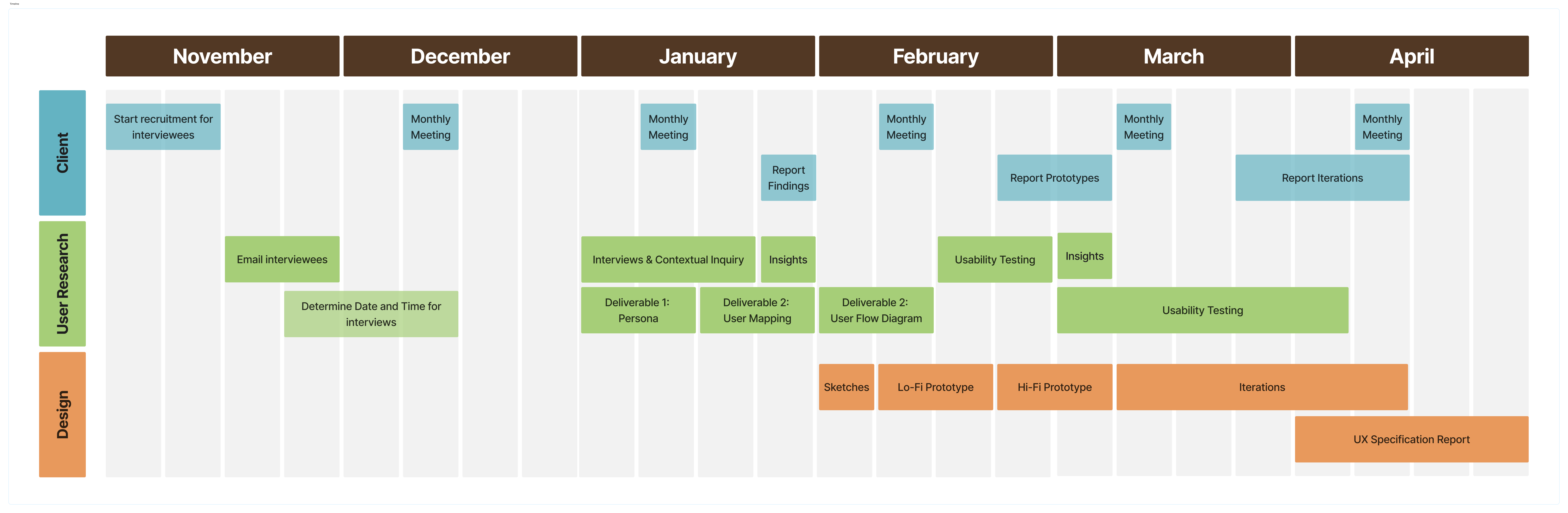
Good UX doesn’t happen by accident. It happens by ruthless planning.
Nine months. A full redesign.
Zero room for chaos.
Before we sketched a single wireframe, we locked down a plan — because building something intuitive starts with building a roadmap that actually makes sense.
Let’s get talking.
We ran contextual inquiries and discovery interviews to uncover where users got stuck — and what they really wanted but weren’t getting.
Finding structure in the chaos.
We affinity mapped the chaos into four clear themes that shaped every design move.
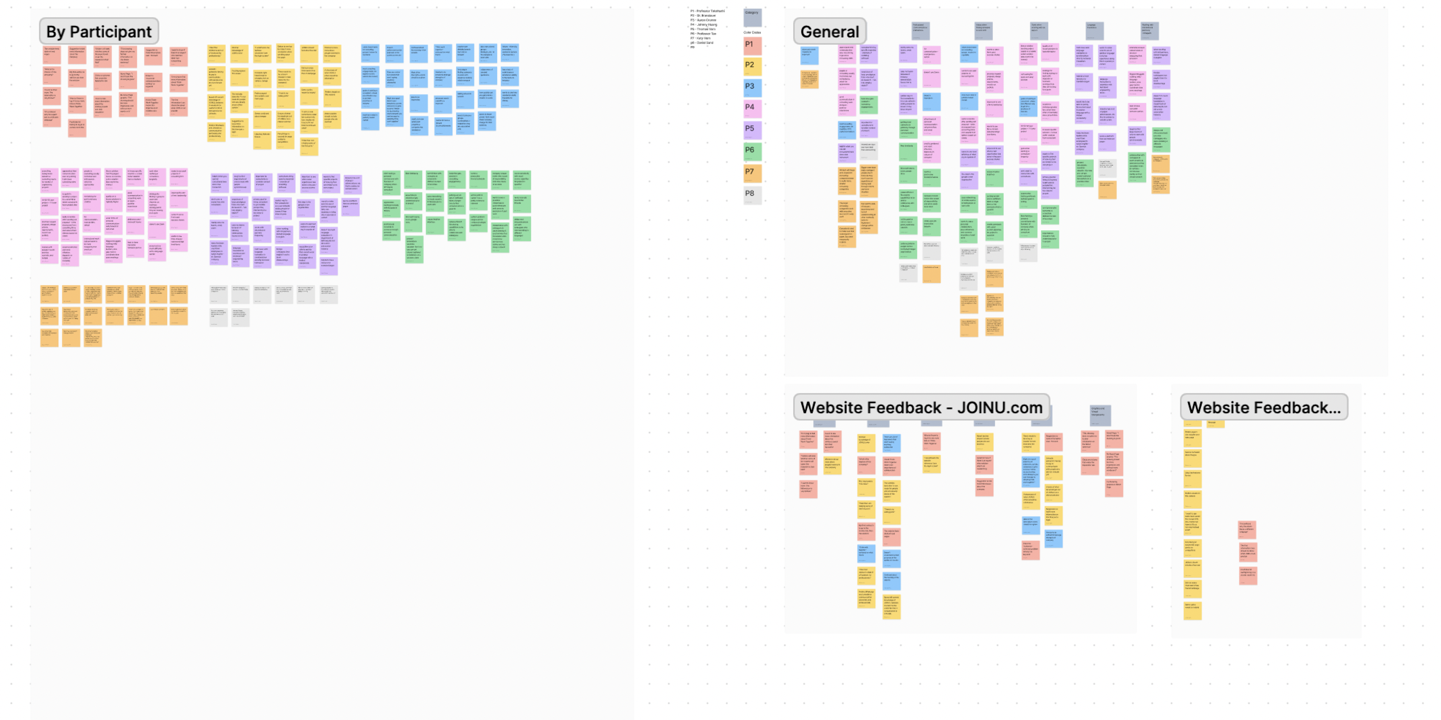
From there, we mapped out 4 main insights, showcasing our users behaviors based on their actions.

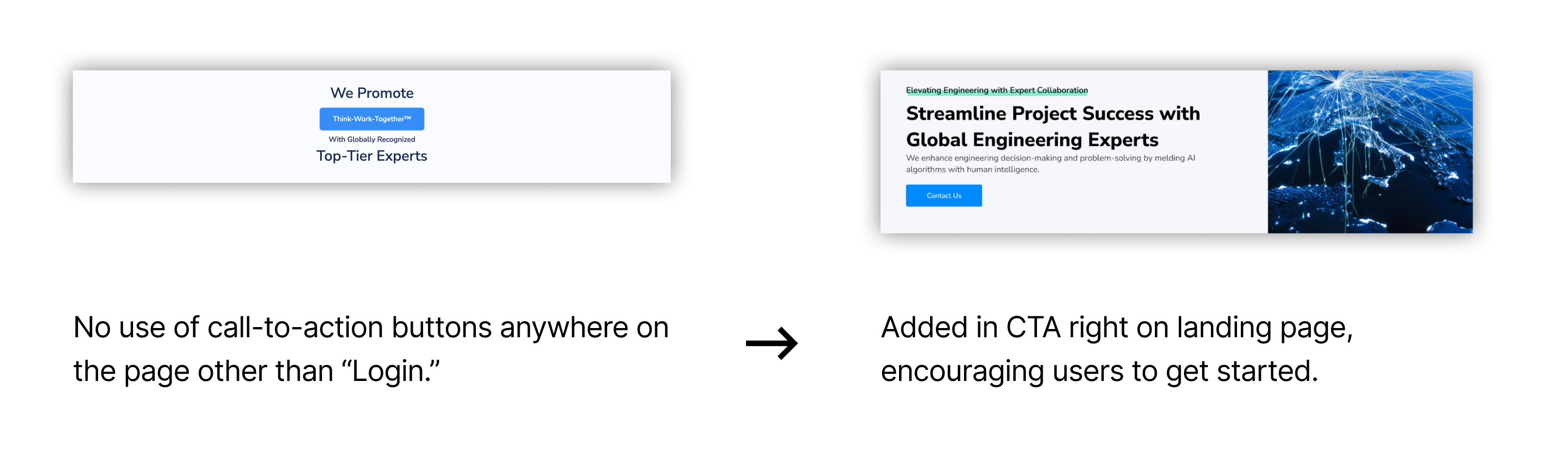
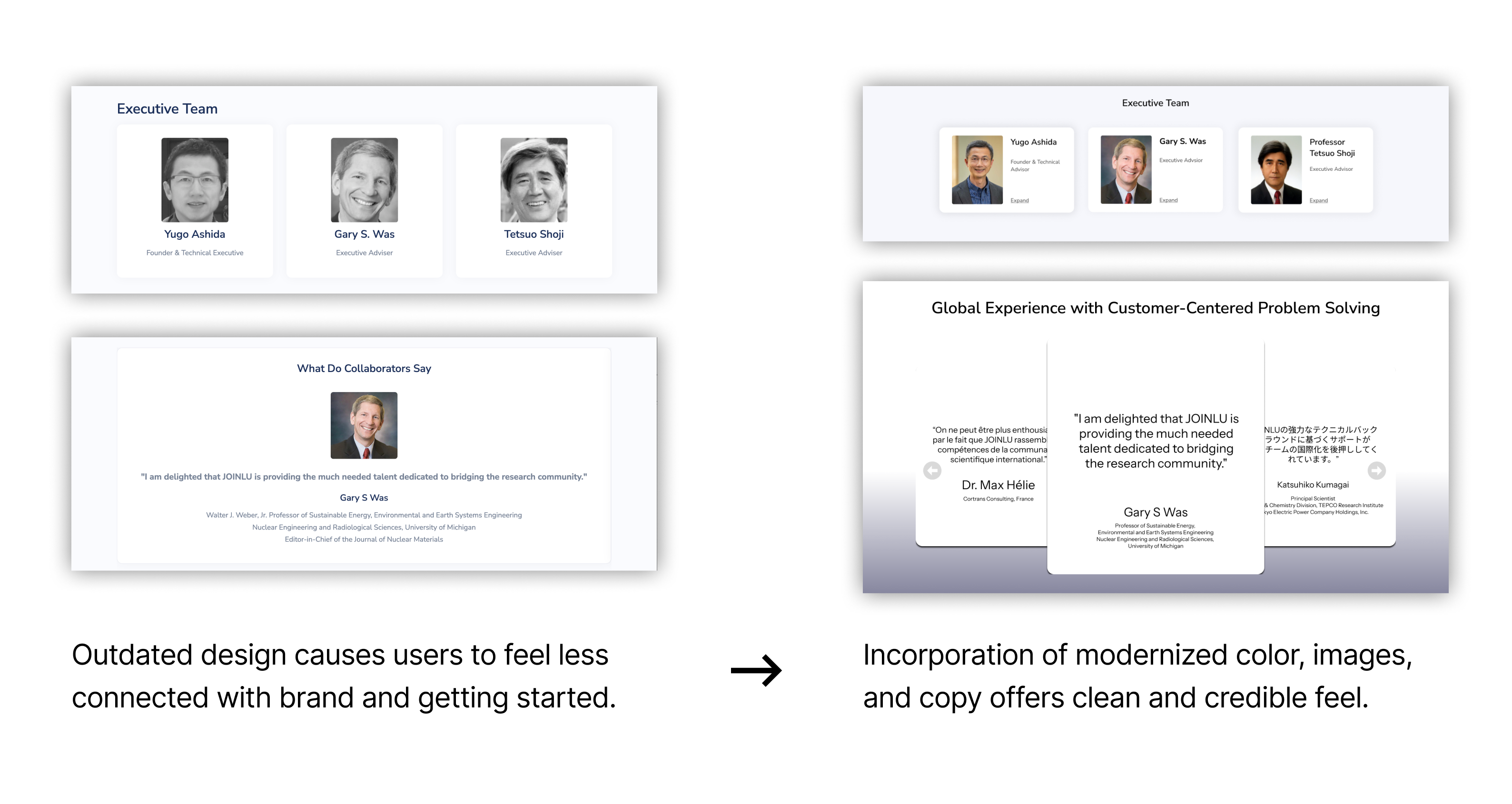
Trust is everything. Show wins early, build credibility fast.

Transparency wins loyalty. Price, process, and reputation up front.

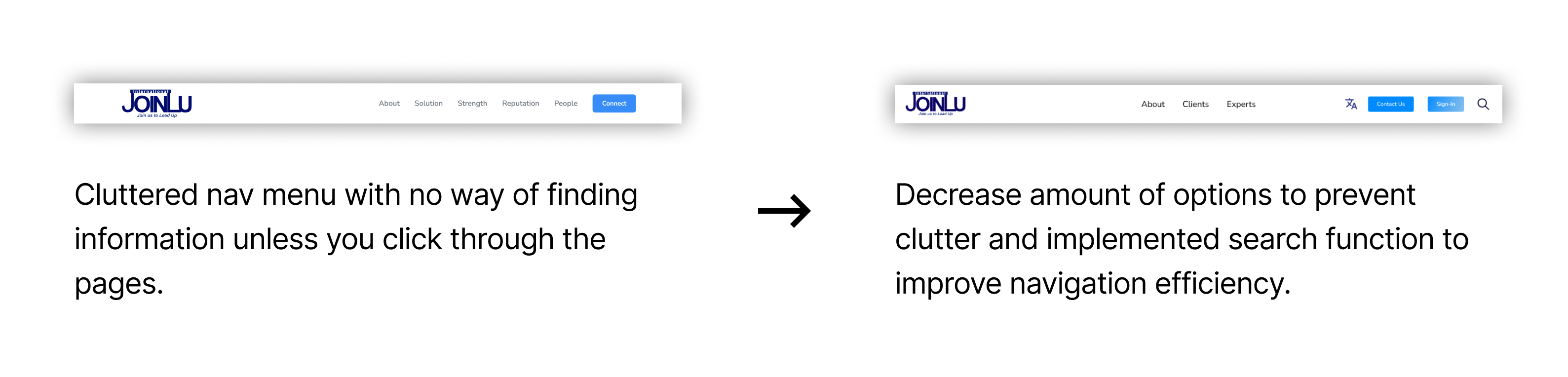
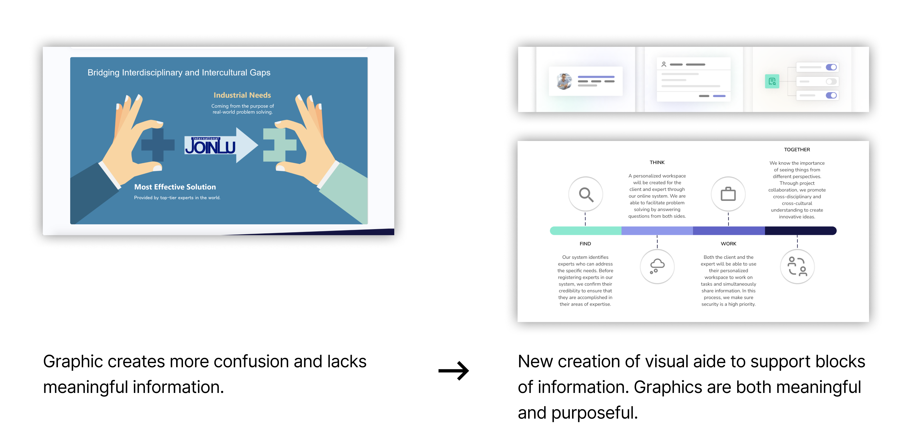
Confusion kills momentum. Simplify information, guide the journey.

Users notice the gaps. Visualize steps. Communicate clearly.

Who?
Academic experts and industry companies make up the majority of our users.

Why?
Users are seeking or offering specialized consulting help in engineering fields.

How?
Most users access the platform via desktop for a full-screen, professional experience.
If we wanted JOINLU to actually stand out, we needed to know where the bar was — and then raise it.
We mapped out what features were considered industry standard and what opportunities were sitting wide open.
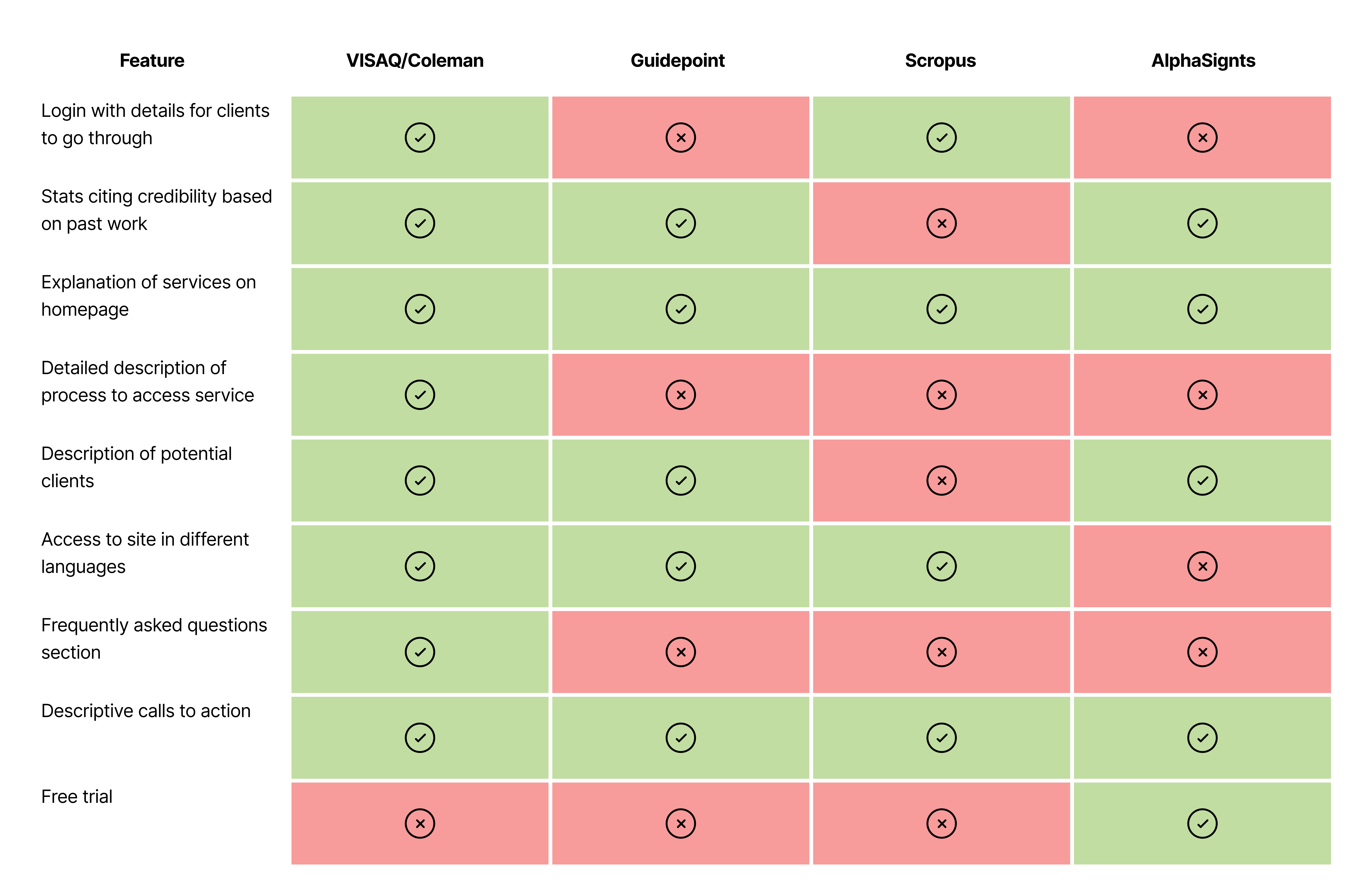
Third time’s a charm.
After sketching the business problem and scoping the landscape, it was time for the fun part: spotting the real opportunity.
Where could JOINLU actually stand out — and not just check a few boxes?
Transform JOINLU’s platform into a smart, intuitive experience by clearly explaining services, guiding users with friendly navigation, and building trust through transparent communication — ultimately moving users seamlessly from “Huh?” to “Heck yes.”
Finally! Some pencil strokes on a very blank canvas.
Every good redesign starts with mapping the lay of the land.
Our user flow diagram became the blueprint — connecting actions, interactions, and tiny but mighty pathways that would eventually guide every click and scroll.
We sat down, ranked what users actually needed, what JOINLU couldn’t live without, and what could be saved for later wishlist dreams.
No need to reinvent the wheel (yet).
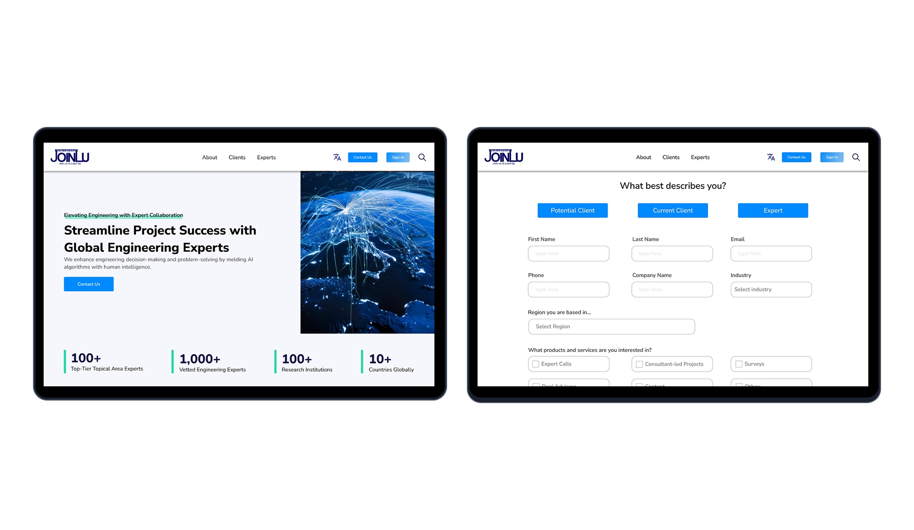
Since JOINLU already had a website in place, we skipped straight to mid-fi prototypes — reworking, refining, and reimagining what was already there.
The goal? Keep what worked, fix what didn’t, and make handoff a breeze when it was time to bring it to life.
Zoom in. Let’s get into the good stuff.
This phase was all about detective work — magnifying glass in hand, we started dissecting the big and small decisions shaping the user experience.
Spoiler: every pixel had a reason.
After all the research, sketches, and sweaty Figma hours — here’s where it all came together.
Click around, get nosy, and see how strategy translated into a smoother, smarter experience.
Good design doesn’t just look pretty — it moves.
This high-level map traces every tap, scroll, and "aha!" moment across the site, making sure every interaction feels intuitive (and just a little bit inevitable).
Putting the design to the Test.
You can talk about good UX all day, but can users actually find what they need?
We ran informal usability tests to see if JOINLU’s new site could walk the walk — and the numbers didn’t disappoint.
Passing the Torch
With the core redesign in place, it was time to hand JOINLU the keys — along with a few friendly warnings taped to the dashboard. Here's what we recommended to keep momentum rolling:

Mind the (Mobile) Gap
Desktop’s looking sharp, but mobile's still waiting for its glow-up. A team should translate the new designs seamlessly across screens.

Accessibility: Not Just a Checkbox
We baked accessibility into the design, but it’s a moving target. Regular checks with tools like WAVE and Axe DevTools will make sure nothing critical slips through.

Test Early, Test Often
Alpha tests will tune up the experience internally, while beta testing with real users will help smooth out the bumps before the big launch.